Of Logo Designs and Life Updates
After an unexpected spam attack altered the functionality of my website, I sat down and took a moment to figure out what I really wanted to do with Writer Shayanne. My thoughts were an endless refrain that echoed questions like, Should I turn it into a poetry archive? Would it be better to write shorter book reviews and analyses? Should I set sail on uncharted waters and try something new instead?
My priority was to strengthen my domain’s security. Once bitten, twice shy. I didn’t want to go through the painstaking process of recovering my old files again.
With that out of the way, I decided to start small and address something that had been bothering me for quite some time—my logo.
The first logo I made was when I published Dream: A Collection of Fictitious Works. Back then, I figured I could take some meaningful elements and put them together in a way that would (hopefully) represent my voice as a poet and a writer.
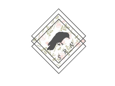
Looking back on it now, the logo I’d spent so long fussing over had a little bit of everything in a way that didn’t necessarily make sense. The floral pattern was because my poems were rooted in nature, and the bird was picked because of my fondness for ravens. Definitely not the most coherent, but I tried my best.
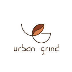
That said, I happened to take a certificate course on graphic design a couple of years ago. Designing a logo was one of the mandatory components there, and I had fun coming up with meaningful concepts. One of my first designs on Adobe Illustrator was for a fictional coffeehouse called Urban Grind.
I’m going off on a tangent here, aren’t I?
Well, one thing I’ve wholeheartedly believed in—even before the emergence of AI—is that a machine can never replicate the heart and soul of humanity. It might be convenient for a business to ask an LLM to generate logo designs, but the actual process and the thought that goes into creating something from scratch is something that generative-AI can never achieve. I’ve always been against it.
So, instead of asking the slop machine to design a logo for me, I grabbed my tablet and opened Clip Studio Paint. Then, this happened:
It didn’t take long for me to sketch the design. After all, the best ideas come when least expected, and all I could think was Eureka!
The ‘W’ of ‘Writer’ was designed to resemble a fountain pen, and the ‘S’ of ‘Shayanne’ looks as though it were drawn with ink. If you squint a little, you might even see a bird.
Naturally, after redesigning my logo, I updated all of the banners on my website. Writer Shayanne is still a work-in-progress, and there’s still so much to update, but I’m determined to share more of myself with the world, so please look forward to fresh content in the months ahead!
